Showing posts with label covers. Show all posts

25 May 2011

The new Paige Toon cover - WHY?

OK, so today was the big Paige Toon cover reveal on Twitter, carried out by the lovely Simon & Schuster UK. Before I say anything, please note that this was probably my most anticipated cover of the year. I wasn't blown away by the two Paige Toon books that I've read, but I bought them all because they were OMG SO PRETTY!!! In case you haven't seen them yet, here they are in all their glory:
BREATHTAKING, AM I RIGHT???
Cover perfection to the T!
These covers could seriously not be any prettier!
I'd frame them and stare at them the whole day, they're just SO BEAUTIFUL!
I mean, LOOK AT THEM! Wow!

Soooo of course I was really looking forward to seeing the cover for her upcoming book Baby Be Mine. I wasn't planning on reading it, but I was 100 % ready to buy it straight up, provided the cover was pretty. (Yes, I'm shallow, so what? :p)
I was fully expecting my mind to be blown, but as it turns out, the publishers have opted for a total re-design. I have absolutely no idea why since the original covers were PERFECT and you honestly cannot top that.
So here's the new design:
I know, right - what the what?! *blinks* Huh?

Please understand I mean no disrespect to anyone and I'm sure the designer did their best, but I'm afraid it has nothing on the original covers, which were GORGEOUS (no, I cannot get over them :p). I guess I wouldn't be so disappointed if this wasn't a Paige Toon book. I still wouldn't buy it, sorry to say, but I would just dismiss it rather than blog about it.

My personal problems with this cover:
  • that head looks all sorts of wrong (straaaange features + what's WRONG with the shape & colour of hair?!) and makes the woman look very unappealing
  • too much blue - serious overkill
  • cheapass fonts!!!!!!! previous covers were all nicely handwritten and wonderful, but this looks SO CHEAP and all these basic fonts honestly enrage me (surely this is not the final version?)
  • overall, it just does nothing for me and looks boring and unappealing - I would never pick it up in a shop
  • there's just something off about it
Again, I mean no disrespect or offence to anyone, but I'm just a bit confused as to WHY this change occured in the first place, that's all. I'm not massively upset because it's not really a book I was planning to read anyway, but I'm just a bit sad there won't be another pretty Paige Toon book sitting on my shelf ...

Darlings, please do tell, what do YOU make of the new look?
What do you like or dislike about it?
Discuss. :)

30 July 2010

YOU WISH - Re-Create a Cover Contest @ Princess Bookie!

The lovely Princess Bookie is running another awesome Re-Create a Cover Contest, yay - read more about it here! I've always been a fan of these and I figured this time I might as well enter since I love covers and rambling about them. For this current contest, you have to re-create the cover for YOU WISH by Mandy Hubbard (which comes out on August 5th!) and here's what I came up with:

Not mind-blowing or terribly imaginative, I know, but it's the best I could do with Paint (true story, lol) and a serious lack of design skillz - it was all just a bit of fun! :)
To view the rest of the entries for this contest, click here and TO VOTE FOR YOUR FAVOURITE COVER, CLICK HERE!

Below is the super cute original cover as well as the plot summary, which explains my cover, hehe.
What if all your wishes really came true?
Kayla McHenry’s sweet sixteen sucks! Her dad left, her grades dropped, and her BFF is dating the boy Kayla’s secretly loved for years. Blowing out her candles, Kayla thinks: I wish my birthday wishes actually came true. Because they never freakin’ do.
Kayla wakes the next day to a life-sized, bright pink My Little Pony outside her window. Then a year’s supply of gumballs arrives. A boy named Ken with a disturbing resemblance to the doll of the same name stalks her. As the ghosts of Kayla’s wishes-past appear, they take her on a wild ride . . . but they MUST STOP. Because when she was fifteen? She wished Ben Mackenzie would kiss her. And Ben is her best friend’s boyfriend.

23 July 2010

Cover Win / Fail: THE PERFECT COUPLE?

So today I was pre-ordering some books that are coming out soon and one that I wanted to pre-order was also THE PERFECT COUPLE by Robyn Sisman. I've had an eye on it for months - the story sounded *fantastic* and the cover that was leaked looked really cute too. So I was all ready to pre-order my copy when, to my horror, I discovered that the cover has been changed - but sadly not upgraded ... So I figured we have a perfect pick for another installment of this feature!
As always, I mean no disrespect or offence, I'm just expressing my humble silly little opinion.


Cover WIN: The original cover that was posted on Chick Lit Reviews, but never confirmed
Cover FAIL: The official cover

I'll admit the original cover doesn't seem to be particulary true to the story as the couple hardly look like they're feuding all over the place, but but but it was so bright and cute and lovely - combined with the awesome plot it would totally make me pick the book up in a bookshop. I swear I would have bought it today if the cover hadn't been changed.

I'm sorry to say, but I strongly dislike the new cover. As you may know, I'm a huge fan of covers with drawings on them, but this drawing is just plain horrible to me - it's a nice concept that seems to fit the story, but terribly executed. As opposed to the previous draft (left), which screams Fun, the new cover tells me this is a story about Boring Old People and thus definitely not something I'd care to read. Which is strange, because I love the sound of the plot, but the cover just completely contrasts with it and thus puts me off too much.

Soooo I'm afraid it appears I'll have to wait for the paperback in this case and hope it gets a better cover before I spend my money on it.

Funnily enough, I've featured the covers of a Robyn Sisman book here before - remember my little rant about the paperback cover of A Hollywood Ending?

Seriously, why fix something that's not broken?

13 June 2010

Cover WIN / FAIL: A Hollywood Ending + Brontë video!

Firstly, sorry - there will be no IMM this week. I've only received one book and it feels sort of silly to feature one single book soooo I've decided I'll just post it along with the books I receive in the next week; trust me, I have some fantastic books on the way and I hope they show up in the next few days because I'm just sooo excited! :)

Secondly, instead of IMM, I've decided to do another Cover Win/Fail feature seeing how it's been a while since the last one. Today I'll be discussing the UK hardcover and paperback covers for A HOLLYWOOD ENDING by Robyn Sisman - have a look at them below ...


Cover WIN: the hardback cover
Personally, I think this cover is absolute PERFECTION and I adore pretty much everything about it - the illustration, the font, the colours etc. I haven't read the book yet, but it seems to fit the title well, don't you think? Beauuuutiful!

Cover FAIL: the paperback cover
As I said, I love the UK hardback cover so I struggle to understand why someone would want to change it at all, let alone to this pinkish mess. It's not terribly ugly, but for me it just doesn't work - the backgroud colour isn't too bad as it stands out nicely, but I really don't like neither the font nor the boring illustration. I wouldn't mind this cover too much if it was the original one, but having seen the hardback cover, the paperback one just fails (imho), end of.

So yes, that's why I bought the hardcover copy, even if it was nearly twice as expensive, but the fantastic cover is totally worth the money. I'm still confused about WHY they changed the original cover, hmmm. Oh and there's also the US cover, which you can see on the right (click to enlarge) and I have to say I like this one too, but not quite as much as the original UK one.

Lastly, I came across a fantastic video the other day and I wanted to share it with you all - it was posted on the Allison and Busby blog and it shows the awesomeness and kickassness of the Brontë sisters (in action figure form, heh). It's fantastic so check it out below. :)

16 May 2010

Cover WIN / FAIL: Angelic covers? + Winners announced!

It's cover talk time again, woohoo! Yeah, it's been a while, but I just had so many other reviews and interviews to post that I just couldn't squeeze it in, but now the time has finally come to spotlight two covers that got my attention recently - one took my breath away and the other one made me raise my eyebrows, heh. As always, I mean no offence - I'm just expressing my humble personal opinion and you're more than welcome to disagree - tastes differ, after all. :)

Anyway, this week I decided to spotlight two books that both deal with the subject of angels. Quite frankly, this sort of books are way out of my comfort zone so I must confess I didn't really read the summary for either of the books below, I'm just focusing on the covers, which really are special.


Cover Win: HALO by Alexandra Adornetto
Honestly, doesn't this cover just make you go, 'WOW!'? I think it's absolutely beautiful and I'd buy it for the cover alone, I don't even care what it's about. I'm not usually not a massive fan of "non-drawn" covers as I don't think there's anything amazing about a picture with some text on it, but this one really is beautiful and I can tell that a lot of thought and effort was put into it.

Cover Fail: THE UNFINISHED ANGEL by Sharon Creech
I'm sure there's a good explanation for this cover, but I just can't help disliking it. It's just boring and blah. :( I've noticed this book on another blog where quite a few people called the cover 'adorable', but I just don't see it myself. I would never pick this book up in a bookshop or bother to read about it online, the cover is just too off-putting. I'm sure I'm very wrong to judge this book by the cover as it's aparently very good and it won the Carnegie medal, but still. Luckily, the book was re-designed for the paperback release, which looks a bit better and more like something I'd bother picking up off the shelf in a shop. But the original just makes me frown, I'm sorry.

WHAT DO YOU THINK?
Do you agree or disagree? Let me know! :)

ps: Before I wrap this post up, I still need to annouce the winners of my Ilana Fox competition! Thanks to everyone who entered - I had nearly 200 entries! And yay for Google Docs for making it so easy to pick winners with the help of random.org (yes, I know I'm late)! Anyway, without further ado ...
The two winners of SPOTLIGHT are TINA and NATALIE & the winner of THE MAKING OF MIA is Iffath - please EMAIL ME in the next two days to claim your prizes! Congrats, girls, and I hope you enjoy your faaabulous new books! :)

30 April 2010

Lauren Barnholdt cover change + Book Blogger Hop!

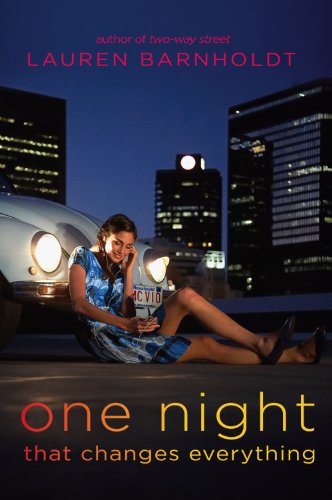
Well, this may be oooold news as I've been completely out of the loop lately, but I've just found out that the two books by Lauren Barnholdt that I'm looking forward to (One Night that Changes Everything & Watch Me) have gone through a major cover change!

Here are the NEW COVERS:

And to refresh your memory, these are the OLD COVERS:


Now tell me, which do you prefer?
In the case of One Night, I think I prefer the new cover, which looks more fun(ky), but the old one had this air of mystery around it and it felt more sinister, which was intriguing ... But the new one's fine by me!
As for Watch Me, I really really reeeeally like the old cover and even though the new one may be more fitting, I still prefer the old one. The new one's not horrible or anything, but it's no match for the old one, bah!

ETA: I just found out that the author explained all the reasons for the cover changes on her blog - see here & here. Fascinating!


ps: It's Book Blogger Hop day - don't forget to join in the fun @ Crazy-for-Books.com! And HELLO to all the lovely bloggers who are visiting from the Hop - hope you'll be sticking around! :)

19 April 2010

Cover Win / Fail #3: PREP

It's time for another Cover Win/Fail feature! If you're not familiar with this feature, it's basically where I spotlight two covers - one that I love and one that I don't love all that much. As always, I mean no offence, I'm just expressing my humble personal opinion and you're more than welcome to disagree. :)

This week I've decided to compare the two Prep covers. Sadly I haven't read the book yet, but I've heard great things about it and I've made it my personal resolution to read Prep in 2010, ha! The book has just received a makeover so what better time to compare the covers, especially since I feel quite strongly about them.


I much, much prefer the new cover on the left. As far as covers go, it's no masterpiece, but (in my opinion) it's miles better than the old cover on the right.

The old cover is incredibly plain and booooring, plus it tells me absolutely nothing about the story at first glance. Is that a belt on the cover? Does it play a super important part in the story or what? Even if it does, this is still a very boring cover - although I have to admit that at least the colours are pretty. I've seen the book around in bookshops, but never bothered to pick it up and see what it's about until someone recommended it to me.

The new cover will be available in July and not only is it far prettier, but it also tells me something about the story and the main character. It's far more eye-catching, even though I somehow have this feeling that the new cover doesn't really represent the main character all that well, but I could be wrong as I haven't read the book yet.

I have a copy of the book with the old cover, but I like the new one so much more that I think I'll just pre-order the re-issued version and then give the old one away once I review the book.

So what do you think of these two covers - which one would you buy if you saw both in a bookshop? And if you've read the book, what did you think of it?

ps: I loooove the taglines on both covers, they really make me want to read the book, heh!
"The OC meets Donna Tartt's The Secret History with flashes of Clueless." & "Sweet Valley High as written by George Elliot."

9 April 2010

Cover Win / Fail #2

It's time for another Cover Win/Fail feature! I have so many of these lined up, but I'm planning to take it slowly, maybe one every week or every two weeks. If you're not familiar with this feature, it's basically just where I spotlight two covers - one that I love and one that I don't love all that much. As always, I mean no offence, I'm just expressing my humble personal opinion and you're more than welcome to disagree. :)
On to this week's picks!


Cover WIN: Living la Vida Loca by Belinda Jones
I absolutely *adore* this cover! The book's not out yet and I have to admit I'm not too blown away by the plot summary, but gosh the cover is just breathtaking! Gorgeous illustration, wonderful colours, pretty text, simply amazing! I can tell that someone put a lot effort into designing this cover and it really paid off! I have such a strong urge to own this book and just stare at it, even if I never read it, lol.

Cover FAIL: The Sweetheart of Prosper County by Jill S. Alexander
I still remember how this cover had me raising my eyebrows the first time I saw it months ago when someone reviewed the book and it stayed on my mind ever since, heh. Sadly I found the cover so off-putting that it took me ages to even bother finding out why there's a cock on the cover and now I know that this book (which doesn't even sound that bad) features a prize-winning rooster - well, the cover may thus be fitting, but *I* still think it's not the best choice for the cover image. I know I'd never pick it up in a book shop, let alone spend money on it, but that's just silly ol' me.

What do you think about these two covers? Alternative opinions are always welcome!

'Till next time, darlings. ;)

ps: It's Friday so you know what that means - time for another Book Blogger Hop, hosted by Crazy for Books! Don't forget to visit her site and participate in The Hop, it's a fun way to find great new book blogs! :)

29 March 2010

Cover Win / Fail #1

As some of you already know, I'm a huge cover junkie. I'll be the first to admit that I judge a book by its cover and I don't think that's necessarily a bad thing ... What I appreciate about beautiful covers is that someone put a lot of effort and thought into it and made it irresistable - I often have the urge to buy certain books just because the covers are a work of art, even if I don't like the story, I just want to stare at the cover, heh. On the other hand, if a cover is (in my humble opinion) poorly designed or boring or just plain unappealing, then I don't feel guilty at all about disregarding a certain book. Because honestly, I *buy* most of my books and if I'm going to spend my money on something, then at least make it worth my while - I want the whole package. Is that weird? I know it's shallow, but I don't feel too guilty about it. :)

I know some people only care about the story inside, but to me the covers are immensly important too and I always comment on them soooo I thought I'd dedicate a new feature here just to the covers. I've decided to call it Cover Win/Fail - it'll be posted sporadically (basically whenever I feel like it :p) and in it, I'll highlight two covers, one that I love and the other that I don't love. Is that wrong, to diss other people's work just like that? I do feel a bit iffy about that, but I mean no harm, no offence, it's all just MY PERSONAL OPINION and please do let me know if you disagree with my choices; other points of view are always welcome.

Anyway, without further ado, here are my two choices:


_

Cover WIN: Encore Valentine by Adriana Trigiani
This is a sequel to Very Valentine (which I won on Novelicious, yay!) and I'm head over heels in love with this cover, it's too pretty for words. Some people don't really like drawn covers, but I'm a huge fan of them so you'll be seeing a lot of them here. And what's not to love about this cover? Pretty colours, lovely font, cute drawing - we have a winner! I'm not crazy about the plot itself, but I'd frame the colour, ha! Gorgeous!

Cover FAIL: I'm So Happy for You by Lucinda Rosenfeld
This one makes me shudder! As I said, I like covers with drawings on them because that tells me that someone put a lot of effort into it, but what I do not appreciate are covers with horrible stock images and normal font on them, eurgh. I really dislike the *orange* dress - who wears dresses like that? And even if a hideous dress like this plays an important part in the story (which I hope it doesn't), I'm sure it didn't have to be reflected on the cover if the publishers wanted this book to sell. So yeah, I dislike the style and the colour of the dress and simple font - it's too boring and unappealing and I'm afraid it wouldn't interest me in reading the back cover to see what it's about.

So what do you think of this new feature, is it too controversial? :) Do you agreee/disagree?

22 August 2009

Two breathtaking covers!

How insanely amazing are the covers below? (click to enlarge)


Dot has just posted a great review of the left one and I've been seeing the right one on various blogs. None of them really sound like my kind of read, but I'll probably buy them both even if I never read them, simply because they're so stunning!

What covers are YOU in love with at the moment? :)